Excel Charts
- Thomas Sherman (Deactivated)
- Bettina Borces
Charts allow you to quickly visualize your data. They are a selectable option from the Report Wizard Format Tab. Projector supports a number of pre-built visualizations.
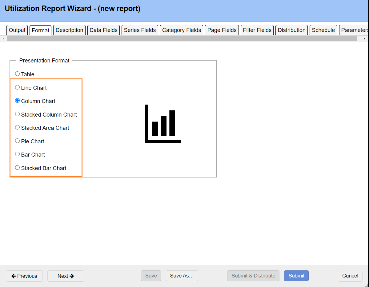
Once you have chosen a chart type the Series tab will replace the Row tab in the report wizard. Your chart will be a combination of fields chosen under the Data, Series and Category Field tabs and map according to the following rules.
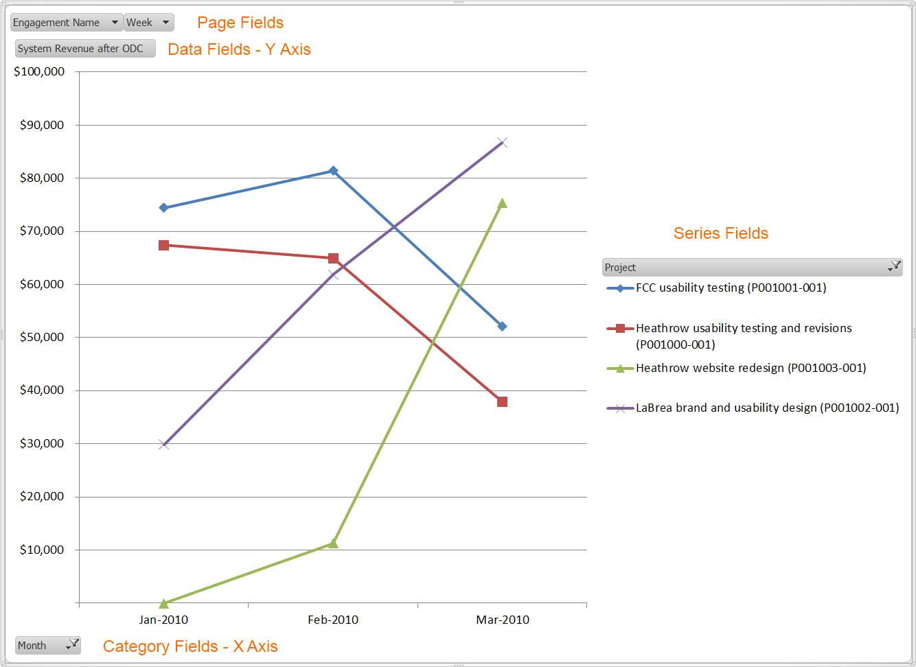
Field | Description | Example |
|---|---|---|
Data | Y axis of chart | System Revenue |
Series | Legend of chart | Project |
Category | X axis of chart | Month |
Examples
So for example, if you ran a Line Ginsu Report and chose the fields from the above chart you would see your timeline on the x-axis, your revenue on the y-axis and a legend for each project. You can see in the image below that two projects are winding down and two are ramping up in revenue generation. After you generate a chart you may still pick the Report tab from within Excel and manipulate your data in the familiar Pivot Table interface.
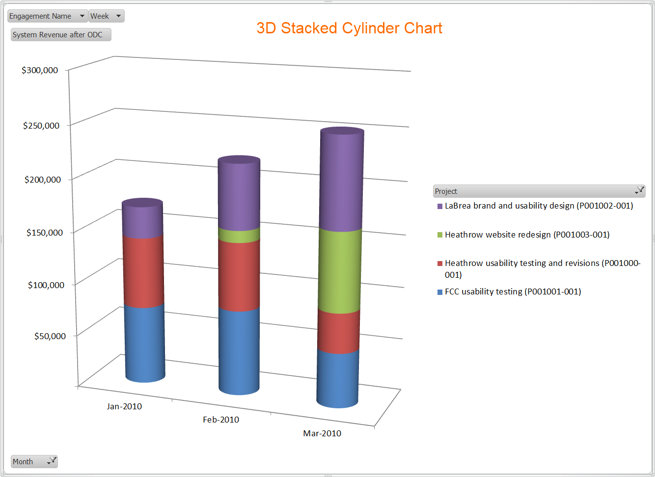
Here is the same data shown in a stacked cylinder chart. Now we can visualize revenue per month and how much each project is contributing to that revenue.