determine whether you want a spreadsheet or a chart for your Microsoft Excel reports
The Format tab appears only for pivot table reports. From here you choose how you want the report data to be output. The default option, Table, is the one most often used and typically seen in Projector screenshots. The remaining options are all variations of Excel charts. You'll notice that when you switch between a pivot table and a chart that some of the other tabs in the report wizard change. When viewing as Table you will see Data and Row fields. When viewing a chart you will see Series and Category tabs.
Each chart type will parse information from the Series and Category tabs differently. See Excel Charts for examples.
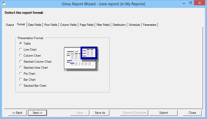
Presentation Format
Format | Description |
|---|---|
Table | Pivot Table of data |
Line Chart |
|
Column Chart |
|
Stacked Column Chart |
|
Stacked Area Chart |
|
Pie Chart |
|
Bar Chart |
|
Stacked Bar Chart |
|