...
| Info |
|---|
Throughout Projector Web you will encounter our Flex Search and Smart Grid. If you are unfamiliar with these tools you should read this page to gain a general understanding about how they function. You'll then be able to apply that knowledge anywhere you encounter them in Projector Web. |
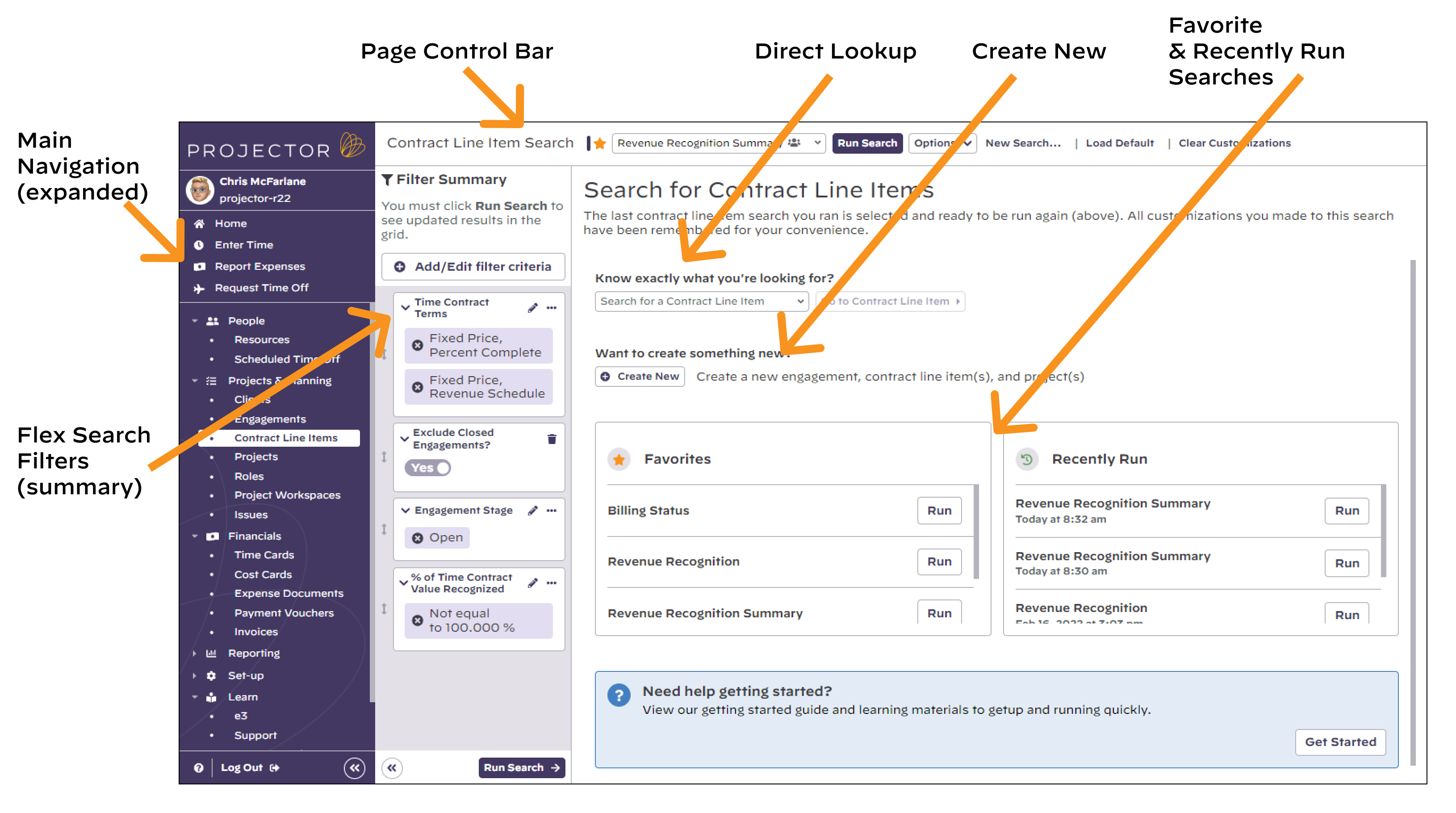
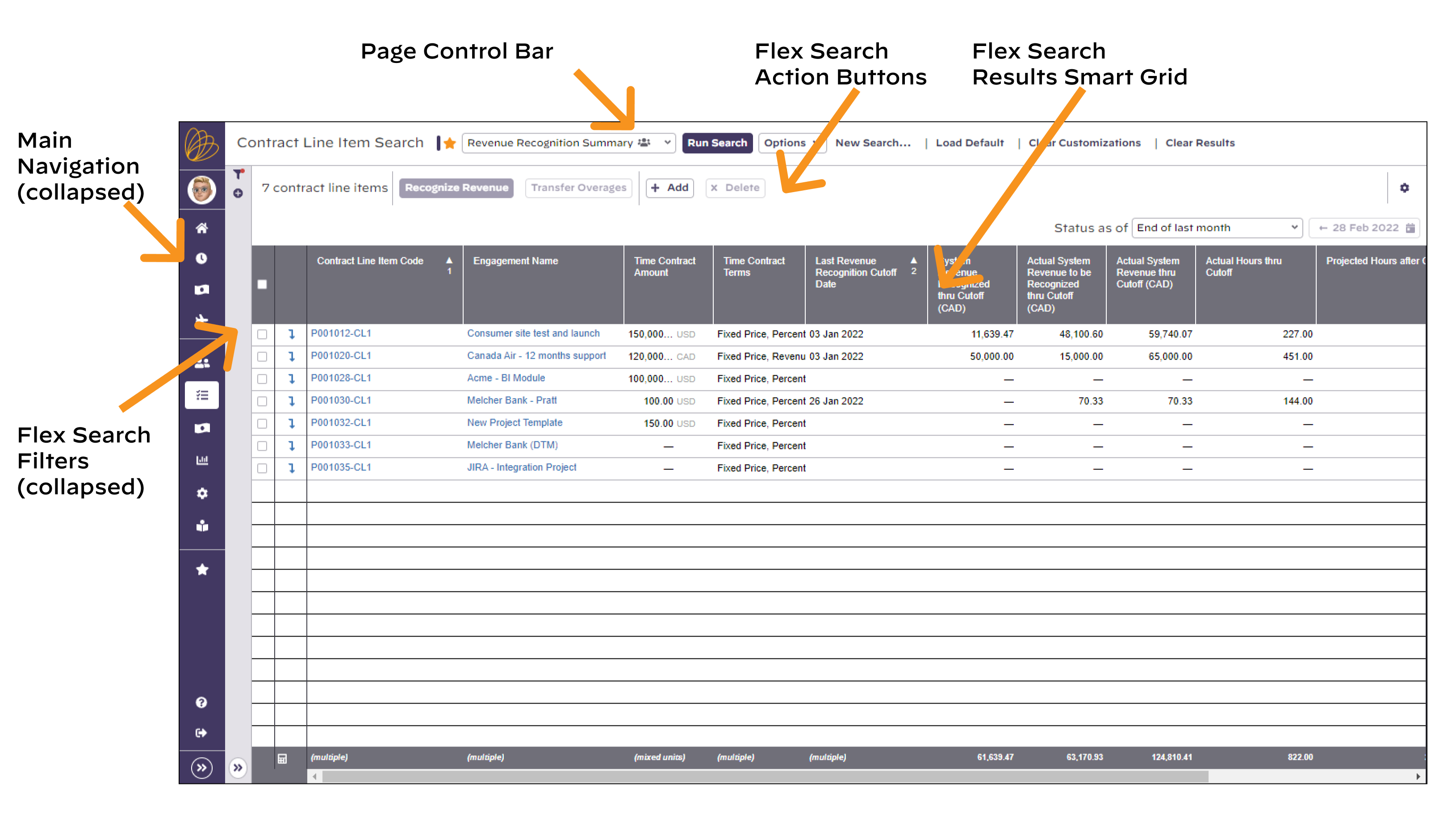
Search Page Pieces & Parts
The search pages within Projector all follow a similar pattern.
- The page control bar indicates the type of search page, the name of the selected search, and entry points for all search-specific actions you can take (e.g. Run Search, Clear Results).
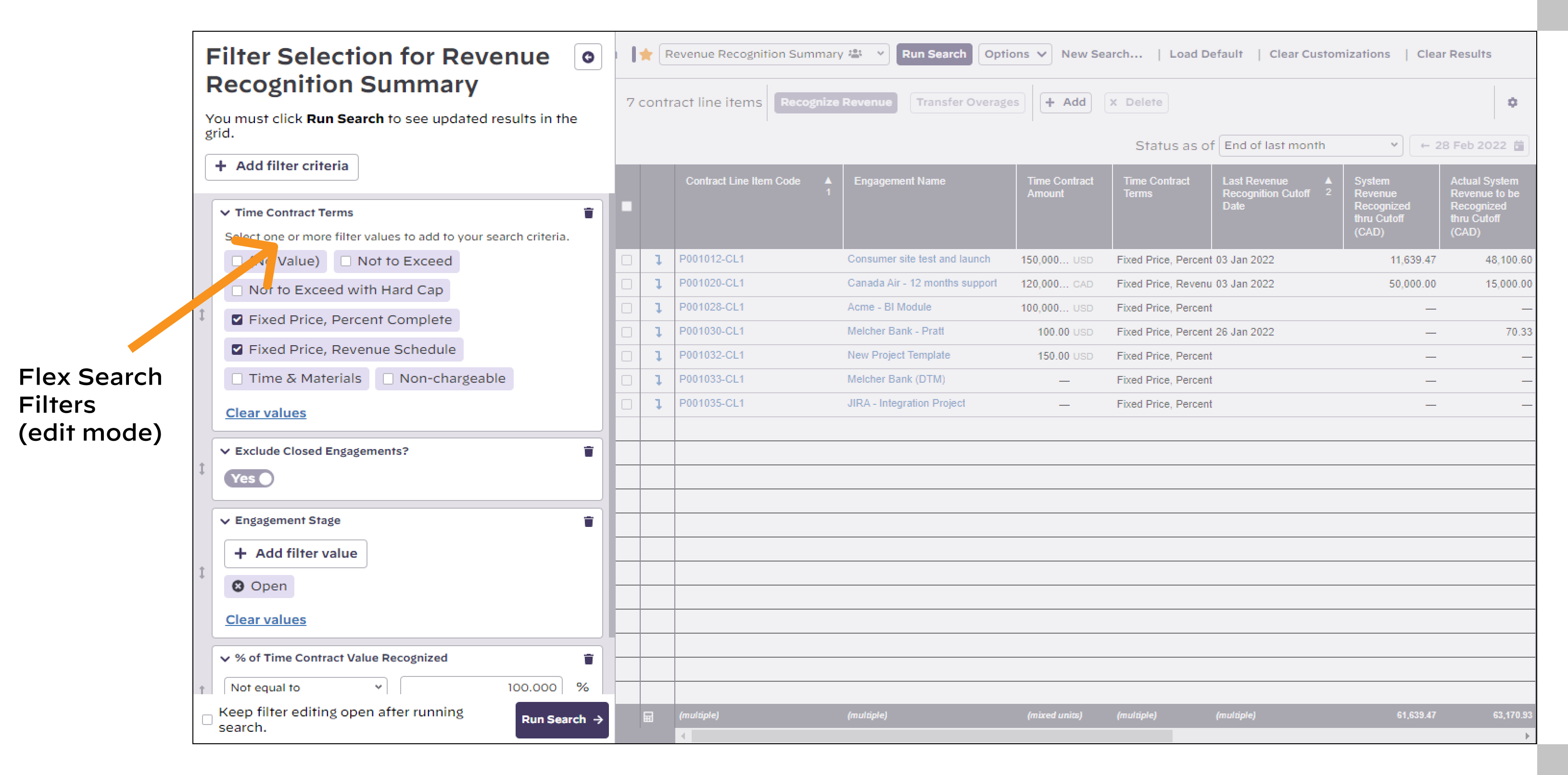
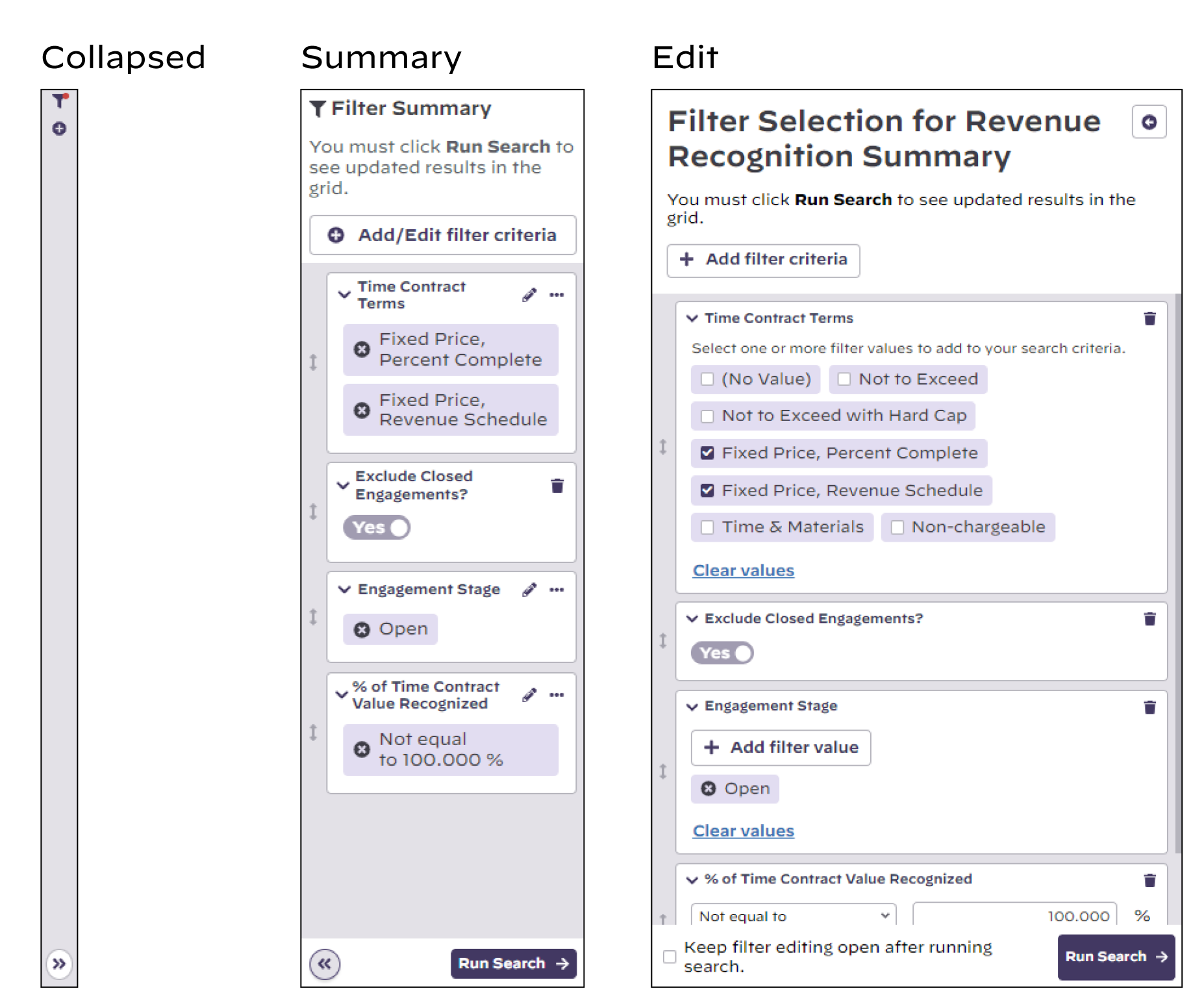
- The flex search filters initially appear in summary mode and can be popped up into edit mode to add and update filter items.
- Search action buttons are tied to the search results grid and allow you to act on the checked items in the results
- Results smart grid is a very flexible data grid that allows you to sort, group, and reconfigure your results data display
Below we show the search page prior to running the search, after a search is run with collapsed navigation and filter panels, and after a search is run with the filter panel opened into edit mode.
Flex Search
The flex search is where you specify your search criteria. It is an easy to use, yet incredibly powerful search tool.
- Add in search criteria like resource name, project name, cost center, etc
- Specify the values you are interested in
- Run your search. Easy!
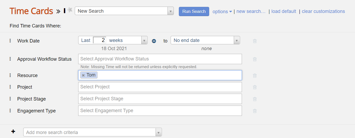 The filter component can be viewed fully collapsed, in summary mode, and in edit mode.
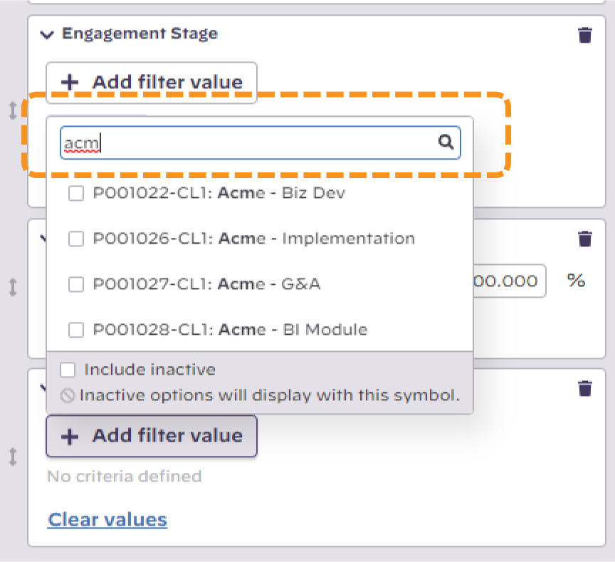
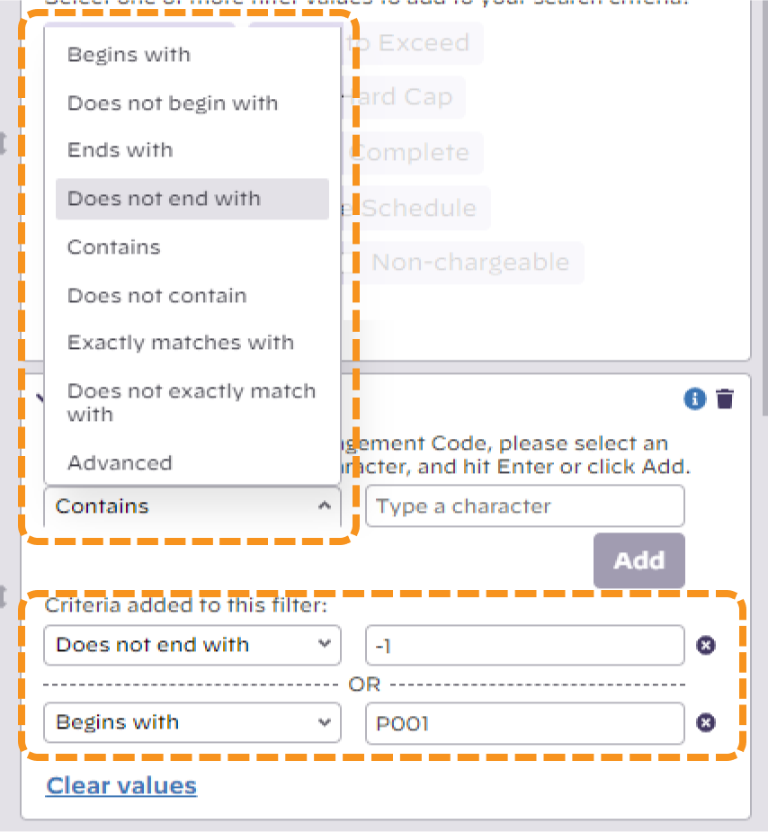
Add Criteria
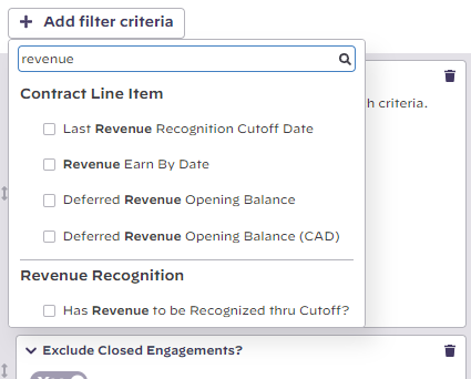
From the dropdown box at the bottom, choose your criteria. You can also type text in to refine the available criteria.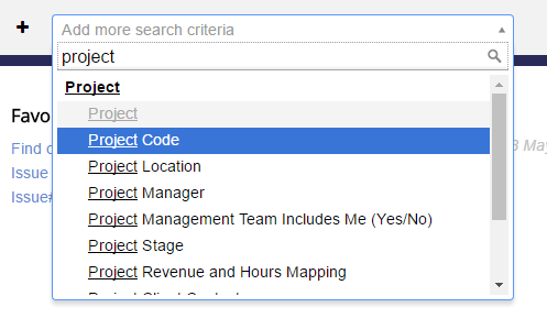 Add filter criteria button at the top of the filter component choose the filter item to add and refine your filter definition.
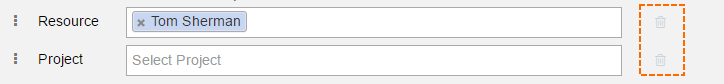
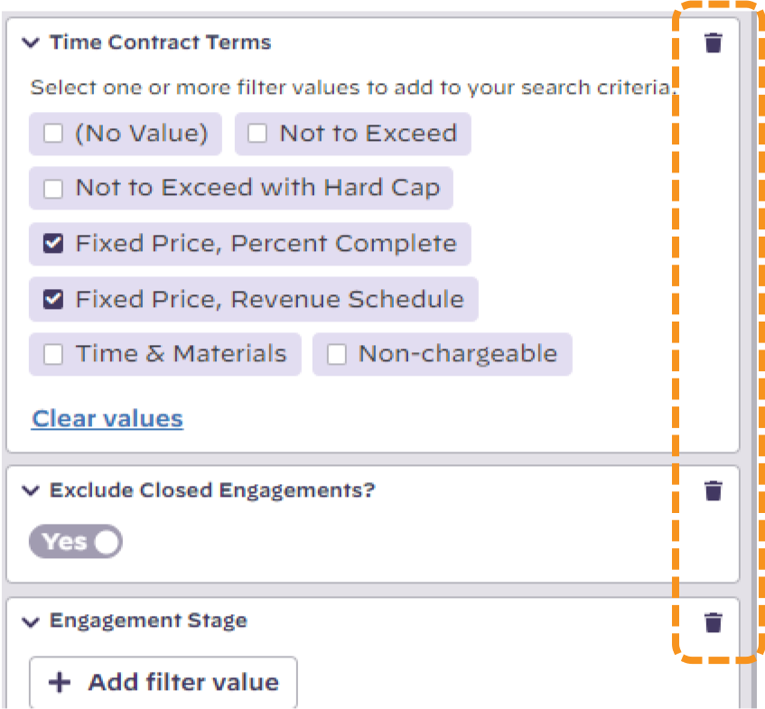
Remove Criteria
Click the trash can icon (
 ) next to a criteria.
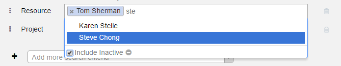
Edit Criteria
Start typing in any text field to see a list of relevant choices. Pick one by clicking on it.
String Searches
Some criteria such as Project Engagement Code or Description can be searched based on a character string. For instance, searching Project Engagement Code using Begins with P001 would return all records with a Project Code such as P00100-001 but not P00200-001. Searching Does not contain - 011 would omit all records with a Project an Engagement code containing hyphen-spaceone -01 1 anywhere in the code.
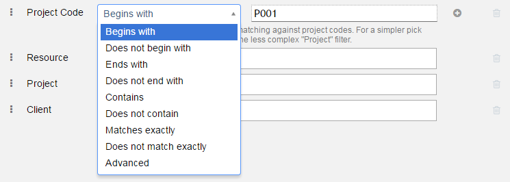
The Advanced option allows advanced pattern matching using the following list of wildcard characters:
...
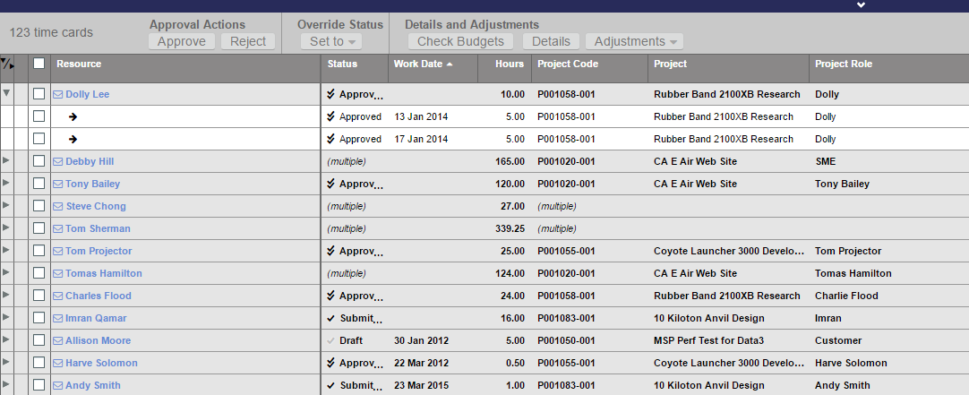
In the screenshot below you can see time cards grouped by resource. I've expanded the top node for Dolly Lee so that you can see the individual time cards.
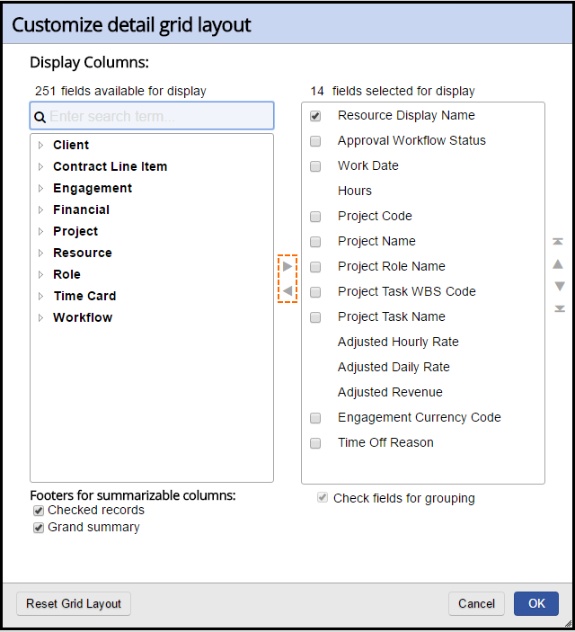
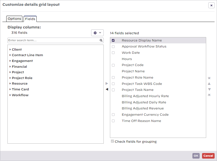
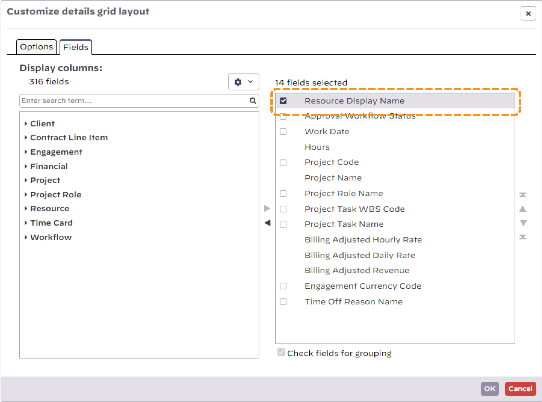
Add/Remove Columns
Click the cog menu icon, , and choose Customize Grid. Columns on the left are available. Columns on the right are the ones displayed. Use the arrow keys or double click to move an item between columns.
Reorder Columns
Click the menu icon,  , and choose Customize Grid. Use the arrows to reposition the column.
...
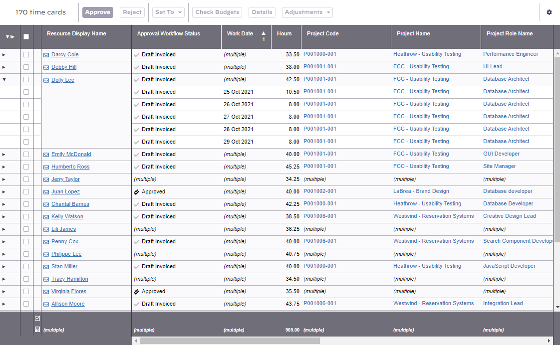
You can also reorder columns directly in the smart grid. Simply drag and drop the column in its new location. The insert location is denoted by a line between columns. You can see the line in the screenshot below - between Project Code and Project Role.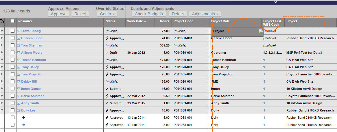
Group Data by Column
...
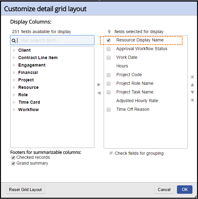
In the screenshot below I have grouped by Resource Display Name.
Short Cuts
If your smart grid uses groupings, you can quickly toggle between them by using the Ctrl + Shift + Number keys. You must use the number keys above the letter section, not your number pad.
...
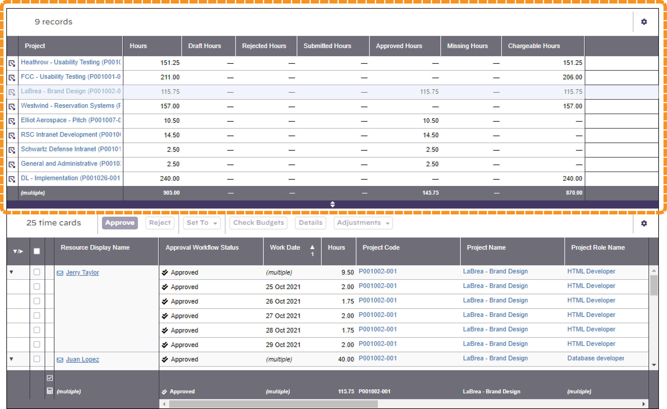
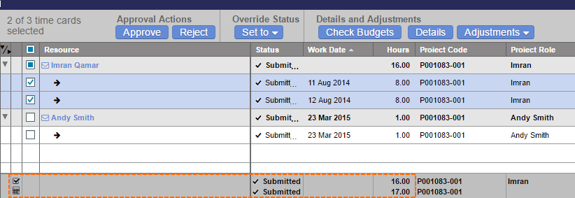
In the screenshot below, the summary grid is on top. When you click on the zoom icon (far left) for a summary row, the individual time cards are shown in the lower details grid. 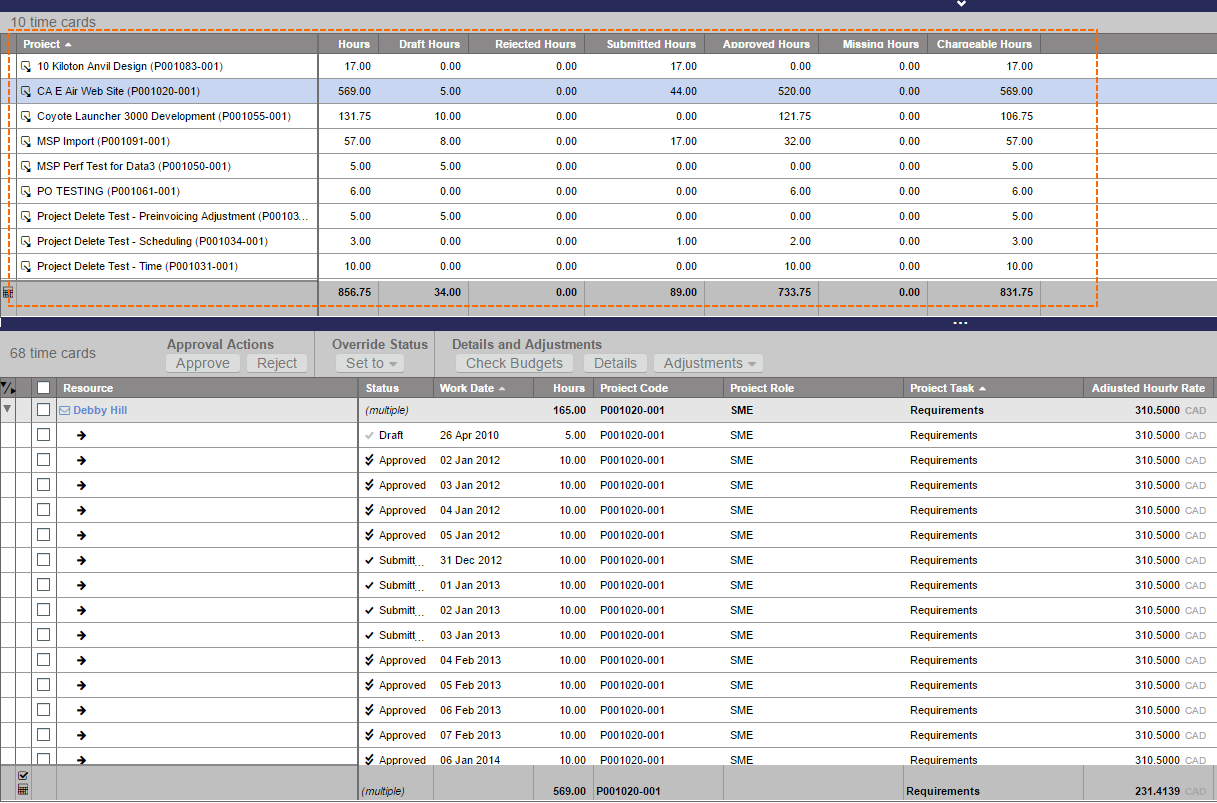 Records in the details grid are available for selection and for use with the action bar.
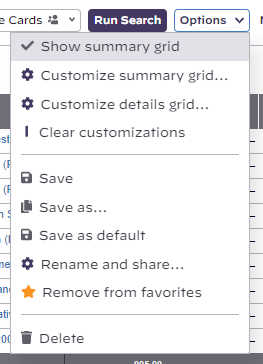
To enable or disable the summary grid, click Options | Customize results grids | Grid Display Options | Choose Summary Grid with Details
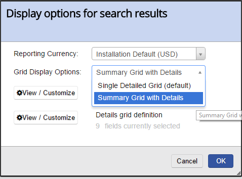
You can then click View/Customize from the options dialog to specify the summary grid columns and grouping. Or click the menu icon () on an existing summary grid.toggle the menu item for Options | Show summary grid
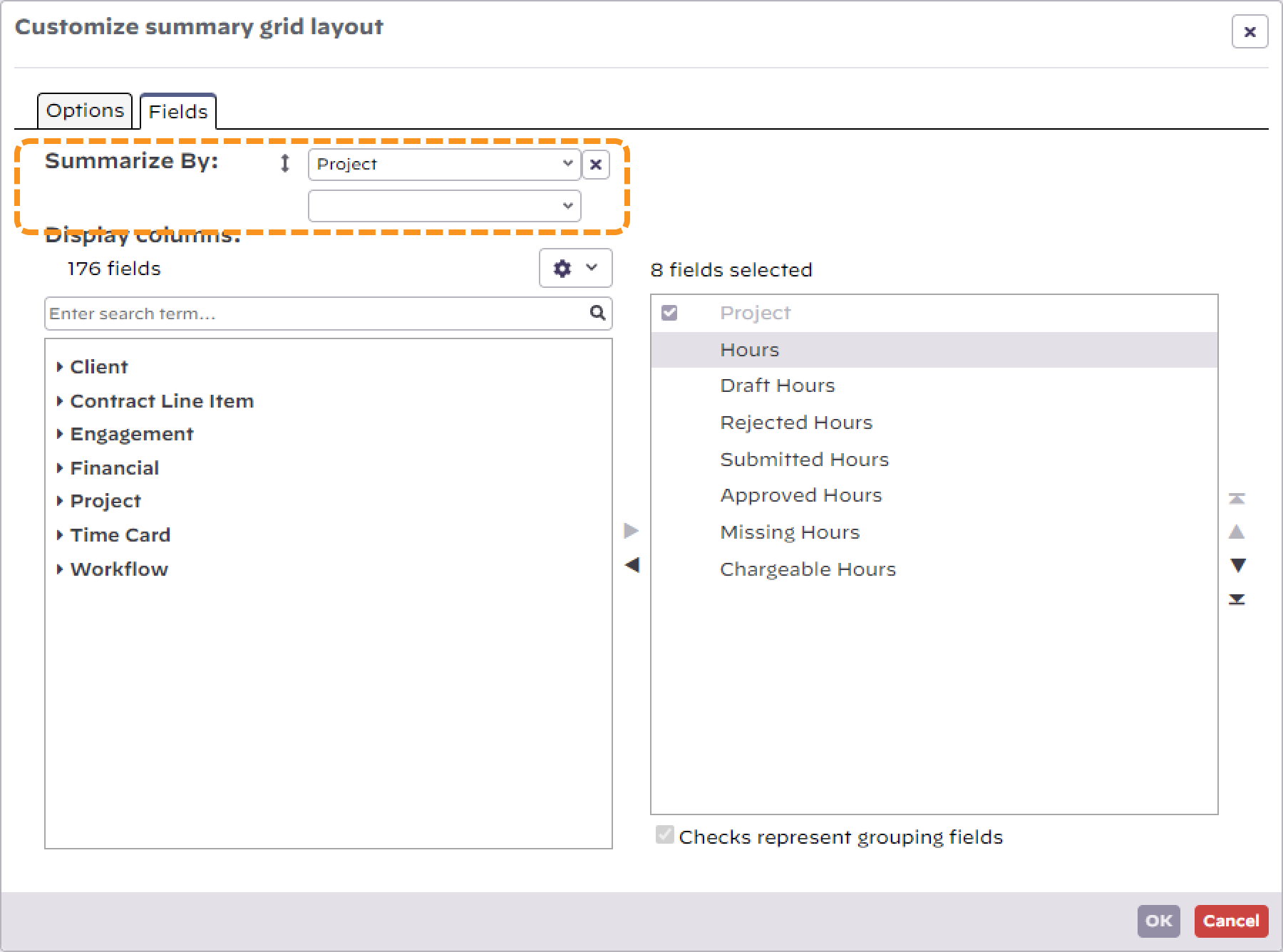
Notice in the screenshot below that the summary grid dispenses with the checkboxes for grouping and you instead use the dropdown boxes at the top to summarize your data. You can group summarize on up to three columns.
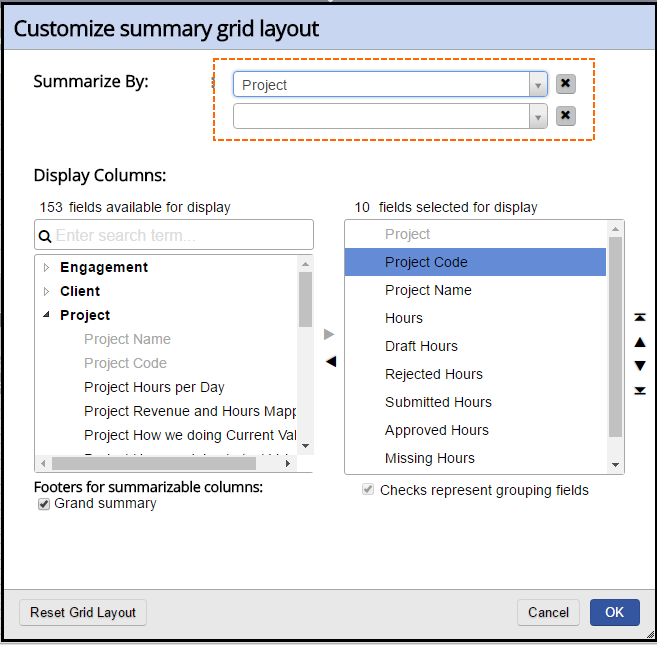
Tick the Grand summary checkbox if you want to see subtotals in the summary area.
Subtotals
On the customize grid screens you'll see options for displaying totals.
- Checked summary - subtotal all items with ticked checkboxes
- Brand summary - subtotal all items regardless of checkbox state
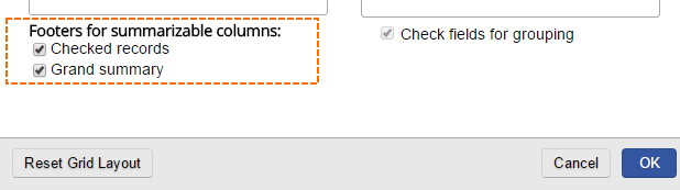
In the screenshot below the checked summary and grand summary are shown.
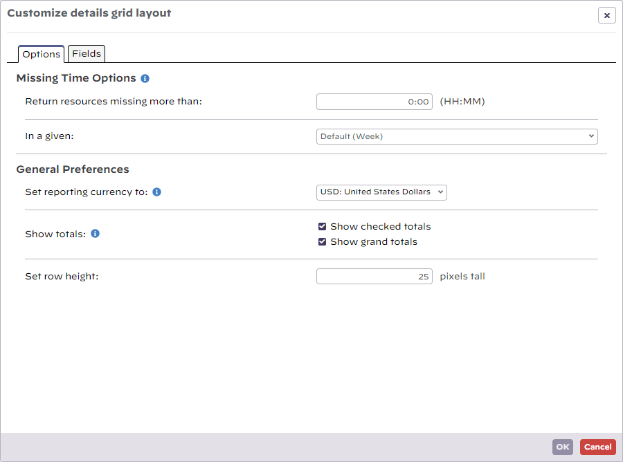
Options Grid
Click the icon
Customize Layout Options
Click the cog icon and then the customize grid menu to bring up the options editor.
...
, where you can find a variety of display options that are specific to the type of content available to the grid you are working with.
Sample Options - Time card search.